 |
| Digital art. |
Ughh... You smell that? That... indescribable, unbelievable and outrageous smell... of art? CRAP! No, art... or is it CRAP?
Well, which one is it?
Trick question.
They're both the same... kind of.
CRAP—not that gross stuff you find on the ground, especially when geese are around—stands for:
Contrast –making similar items the same and different objects, well, different (i.e. by using different styles of fonts; different kinds of lines; orientation of images and font ; and complementary colours)
 |
| Example of contast. |
Repetition – repeating some elements throughout the piece (i.e. fonts, shapes, sizes of lines/brushes, colours etc.) to reinforce a branding, create unity and promote reliability
 |
| Example of repetition (created by me). |
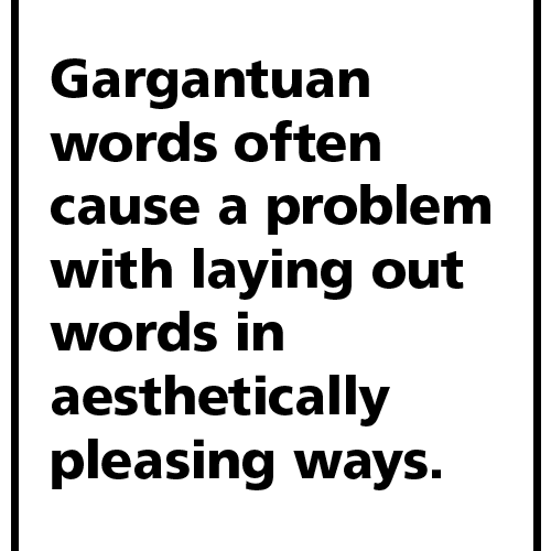
Alignment – arranging images and text in a way that makes it visually appeasing and convenient to the viewers (i.e. aligning text to the right/left, centering text, justifying text etc.)
 |
| Example of alignment. |
Proximity – grouping objects of similarity together and distinctive images a part (creates unity, organization, not hard to read/view etc.)
 |
| Example of proximity. |
For a more thorough explanation of other artwork, check out:
Digital Art
Contrast
Alignment
Proximity
No comments:
Post a Comment